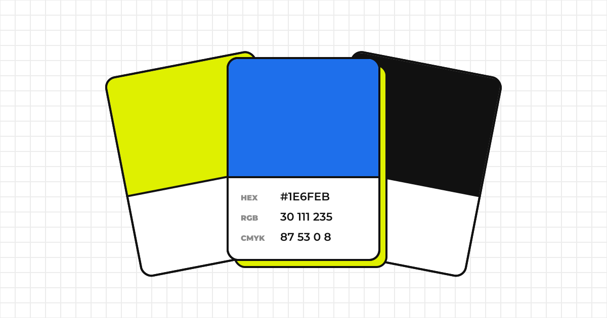
A brand color is often written as a single value such as #1E6FEB, but that value is for seeing on a screen. Print needs a different one, and where the color must not drift you refer to a swatch number instead.
This article explains how HEX, RGB, CMYK and spot colors (DIC, PANTONE) differ and when to use each, starting with a table by medium. It also covers how to write colors in your guidelines, and how to tell whether a color can be used for text.
How should a brand color be written for each medium?
| Medium | Notation | Example |
|---|---|---|
| Websites and apps | HEX (or RGB) | #1E6FEB |
| Slides and Word | RGB | 30, 111, 235 |
| Offset print (business cards, flyers, brochures) | CMYK | C87 M53 Y0 K8 (rough, from a formula) |
| Print where color must not drift; fluorescents, gold, silver | Spot color (DIC or PANTONE number) | A swatch number |
| Signs, paint and molded parts | A swatch number | DIC, PANTONE, paint standards |
What is the difference between HEX and RGB?
They are two ways to write the same color. A screen makes color from the intensity of red, green and blue light. RGB writes those intensities as numbers from 0 to 255, in the order red, green, blue. HEX writes the same three numbers in base 16, two digits each, side by side, with a # in front.
For example, in #DFF000 the red DF is 223, the green F0 is 240 and the blue 00 is 0, so in RGB it is rgb(223, 240, 0).
- If the two digits of each channel are the same (such as
FF,CC,00), the value can be shortened to three digits:#FC0is the same as#FFCC00. - Upper and lower case mean the same. In your guidelines, pick one and stay with it.
- The reference for color on the web is the sRGB color space. HEX and RGB both describe a color on a screen in that space.
Which one you use depends on the tool. Web work usually takes HEX, while slides and design tools often use RGB, though many tools offer both fields. Either way, the same color results.
What is CMYK, and why can’t RGB be converted to it exactly?
CMYK describes a color by how much of four inks — cyan, magenta, yellow and black — is used, each as a percentage. Print lays ink on paper and makes color from the light the paper reflects, the opposite of a screen, which adds light.
So the range of colors each can reproduce (the gamut) is different. A vivid yellow-green or blue that a screen shows may not be reachable in CMYK and comes out duller. The paper (coated or matte) and the printing conditions change the result too. In Japanese commercial printing, Japan Color profiles are widely used.
A CMYK from a formula is only a rough guide
You can derive CMYK from RGB mechanically: K = 1 − max(R, G, B) ÷ 255, C = (1 − R÷255 − K) ÷ (1 − K), and the same for M and Y. Applying it to Acme’s main color, rgb(30, 111, 235), gives C87 M53 Y0 K8.
But the formula knows nothing about gamut or paper. The values that actually get printed are adjusted to suit the printer’s conditions. The conclusion: don’t rely on conversion. Decide RGB and CMYK separately from the start, and write both down.
When should you use a spot color (DIC or PANTONE)?
A spot color is a pre-mixed ink printed as a single color. Unlike combining the four CMYK inks, the same number means the same ink, so the color drifts far less, though the paper and the thickness of the ink still change how it looks.
- DIC: color numbers from the DIC Color Guide by DIC Corporation. Widely used in Japanese printing.
- PANTONE: swatch numbers from Pantone in the United States. Often specified in international work. Numbers carry a paper suffix — C for coated, U for uncoated — so write, for example, “PANTONE 286 C”.
Use one in these cases:
- When a corporate color has to be held tightly
- For fluorescents, gold or silver, which CMYK cannot produce
- To reproduce a vivid color that CMYK would dull
A spot color adds a plate, which raises the printing cost. For short runs such as business cards, CMYK is often used to approximate it, so write in your guidelines both the spot color number and its nearest CMYK and you are covered either way.
How should colors be written in the guidelines?
| Name and role | HEX | RGB | CMYK (rough) |
|---|---|---|---|
| Acme Blue (main) | #1E6FEB | 30, 111, 235 | C87 M53 Y0 K8 |
In a real guideline, this CMYK column holds the values agreed with the printer. The figure here is a rough one from a formula.
- Give each color a name. It makes the color easy to refer to when sharing.
- State its role. Say for each color whether it is main, secondary, background or text.
- Keep one format. HEX with a
#in upper case, RGB as 0–255 numbers separated by commas, CMYK in percent. - Separate screen from print. Screen: HEX and RGB in sRGB. Print: CMYK, plus a spot color number if you use one.
How MediaKit™ handles colors
The color section in MediaKit™ shows each color’s name and its HEX and RGB values for screens. Clicking a value copies it to the clipboard. To publish CMYK or a spot color number, add it as text in the overview of your guidelines. The steps are in the upload guide.
Can a brand color be used as a text color?
Whether text is readable is judged by the contrast ratio between the text and its background. At level AA of WCAG 2.x, the international web accessibility standard, normal-size text needs 4.5 : 1 or more, and large text (about 24px or more, or about 19px or more in bold) needs 3 : 1.
The ratio comes from each color’s relative luminance: (lighter luminance + 0.05) ÷ (darker luminance + 0.05). A checker tool will calculate it from two colors, so there is no need to memorize the formula.
| Text color | Background | Ratio | Normal text (AA) |
|---|---|---|---|
| #DFF000 | White #FFFFFF | 1.26 : 1 | Fails |
| #DFF000 | Black #000000 | 16.6 : 1 | Passes |
| #1E6FEB (Acme Blue) | White #FFFFFF | 4.64 : 1 | Passes (barely) |
#DFF000 is one of the brand colors registered in Creators Team Inc.’s kit. It can’t be used as a text color on a white background; use it on black, or as a background color. State, color by color, which backgrounds text may sit on, and you prevent low-contrast mistakes.
Note that WCAG sets no contrast requirement for text that is part of a logo (a logotype). This section is about using a brand color for ordinary text, not about the logo itself.
Common mistakes, and how to fix them
NG
Giving the printer only a HEX value and getting a duller color back.
Specifying a color by name alone, such as “corporate blue”.
Expecting the printed color to match what the screen showed.
OK
Adding CMYK, and a spot color number if drift matters.
Writing the name with its HEX, RGB and CMYK values together.
Checking print against a swatch or a proof; monitor settings change how a color looks too.
- Each color has a name, role, HEX, RGB and CMYK
- CMYK was checked against the printer’s conditions, not left as a formula value
- Colors that must not drift carry a spot color number
- Each color states which backgrounds text may sit on
- One format throughout (the #, upper case, units)
The overall structure of the guidelines is covered in How to Write Brand Guidelines: Six Essentials. Choosing logo file formats is in Logo File Formats: SVG, PNG, PDF and AI.