The two questions a logo guideline gets asked most are “how much space should I leave around it?” and “how small can it go?” If the answers are vague, the guideline isn’t followed.
This article is for the publisher of the logo: how to decide those two numbers and how to write them down. For the reader’s side, see Logo Usage Rules: Permission and Clear Space.
What is clear space?
Clear space (also called the isolation area) is the margin around a logo that nothing else may enter. When text or shapes sit close by, they read as part of the logo and its form is lost. The margin keeps the logo from being mistaken for something else.
Which unit should clear space be written in?
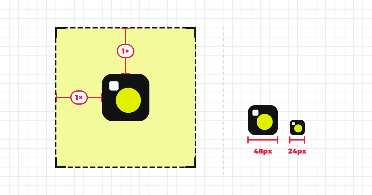
A logo appears on a business card and on a sign. A fixed value such as “10px” fails when the size changes. So use a part of the logo itself as the unit, and write “1× the logo’s height”. Scale the logo up or down and the margin scales with it.
| Unit | Meaning | Suits |
|---|---|---|
| Logo height | The height of the whole logo is 1 | Wide logos, horizontal sets |
| Logo width | The width of the whole logo is 1 | Tall logos, vertical sets |
| Pixel | A fixed size on screen | Icons and other places where the size is fixed |
Some guidelines use the symbol’s height as the unit. Whichever you choose, use the same unit for the same kind of logo, and define each unit in the guideline.
One caveat: a logo image doesn’t reveal the size of its text or of its symbol, so MediaKit™ offers only the units it can measure from the whole logo. If you want a unit based on the text or the symbol, define it in words in the guideline body; the figure can’t draw it.
How do you decide the margin?
- Choose the unit. The logo’s height for a wide logo, its width for a tall one: whichever makes the figure easy to read once drawn.
- Set a starting value. If unsure, begin at 1× the unit. When no amount is set, MediaKit™ shows “1× the logo’s height” on the public page.
- Test it in the tightest real case. A corner of a business card, an app header, a slide footer: try the margin where the logo will really sit. A value that can’t be met there won’t be followed.
- Adjust. If it can’t be kept, reduce the value, or provide a form for places without room (the symbol alone, for example).
- Write the exception. “If the margin can’t be kept, use the symbol only” gives people a way out that doesn’t depend on their own judgment.
How do you decide the minimum size?
The minimum size is the lower limit below which fine detail is lost or text can no longer be read. To set it:
- Test at real size. On screen, view it at 100%, not zoomed; for print, make a test print. Measure the size at which the thinnest line and the smallest text can still be read.
- Round up to a clean number, with margin. Not the bare limit: round a little larger.
- Set it per kind of logo. A symbol alone can go small; a logo with text, or a long horizontal one, needs more room.
- Set screen (px) and print (mm) separately. The real size of a screen pixel changes with the device’s resolution and zoom, so px and mm don’t convert one to one.
Unlike clear space, a minimum size is written as an absolute size (px or mm), not as a proportion of the logo. “1× the logo’s width” means nothing as a minimum.
If you have no idea where to start: MediaKit™’s reference values
For a kind of logo whose owner hasn’t set a minimum size, MediaKit™ shows the values below on the public page. These are MediaKit™’s reference values, not an industry standard. Treat them as a starting point, and prefer a value you have measured on your own logo. The px and mm columns are separate targets, one for screens and one for print; neither is converted from the other.
| Kind of logo | Screen (px) | Print (mm) |
|---|---|---|
| Symbol | 24 | 8 |
| Logotype (logo with text) | 80 | 20 |
| Vertical set | 64 | 16 |
| Horizontal set | 96 | 24 |
The values grow from the symbol to logos with text, and the long horizontal set is the largest.
How should the guideline be worded so that it gets followed?
“Enough space” and “not too small” are read differently by everyone. Give a number and a unit.
NG
Leave enough space around the logo.
Do not make the logo too small.
OK
Keep at least 1× the logo’s height clear around the logo.
Do not use the horizontal set smaller than 96px wide on screen or 24mm wide in print.
Show clear space and minimum size in a figure too
A number in a sentence doesn’t convey how wide the margin really is. Add a figure that draws the margin around the logo, and people can copy it as it is.
How MediaKit™ handles this
In MediaKit™’s guideline settings, enter an amount and a unit for each kind of logo and a clear space figure is drawn automatically on your public page. It is drawn by measuring the part of the logo image that is actually drawn, and the preview in the settings is exactly what appears publicly. Leave the amount empty and the standard rule (1× the logo’s height) applies; you can also switch a kind off to keep it unpublished. The minimum size is set on the same screen, but for each kind of logo in either px or mm, not both; add the other unit as text in the overview. The steps are in the upload guide.
- Clear space is written using a part of the logo itself as its unit
- It says the margin is measured from the edge of what is drawn
- The margin was tested in the tightest real case
- There is a way out for when the margin can’t be kept (symbol only, say)
- Minimum size was measured at real size, and screen px and print mm are written separately
- Both have a number, a unit and a figure
For everything a set of guidelines should hold, see How to Write Brand Guidelines: Six Essentials. Which file formats to distribute is in Logo File Formats: SVG, PNG, PDF and AI.